Dispatches from the stacks: library profiles, book reviews and general bibliophilia.
Saturday, 7 September 2013
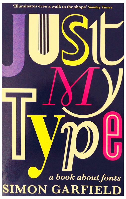
Just My Type: A Book About Fonts by Simon Garfield
There is a serendipitous satisfaction in enjoying a book which found you rather than you searching it out. A while ago I was at the library browsing in the section where I expected to find the 745.6 classmark (calligraphy). Even though my local library holds just four or five books on calligraphy I was surprised that I couldn't find any of the books on the shelf even though the catalogue said they were in the library*. Just My Type jumped out at me with it's striking cover and subtitle, "A Book About Fonts" and although it wasn't what I was looking for I thought I would give it a try.
Before reading this book I can't say that I thought about fonts much apart from choosing which fonts to use for my blog (the main script is Arial - not much thought there then, as this is the font I use for nearly all my computer produced texts - and the blog title and post titles are in Dancing Script which Google Fonts advise using "when you want a friendly, informal and spontaneous look". I wasn't aiming for spontaneity, just a contrast and, yes, I am a sucker for cheesy brush script pretending it's hand written and not really type.
Simon Garfield's survey of fonts deals with: the history of popular typefaces: Garamond, Gill Sans, Times New Roman, Baskerville, biographies of famous type designers: Lucas De Groot, Adrian Frutiger, Eric Gill, Matthew Carter, Margaret Calvert (the designer of Calvert, the font used on the Tyne and Wear Metro), the history and job of type foundries and how the innovations of the digital age have changed the nature of type designing and our relationship with type, "Computers have rendered us all gods of type, a privilege we could never have anticipated in the age of the typewriter."
This book made me look around a lot more at signs (road signs, street signs, shop signs) and think about the form of what I was looking at and not just the content. I have also been paying more attention to the form of the books and magazines that I read. I picked up ten books from my shelves at home and was disappointed to find that only three out of these ten books credited the font on the copyright page. The fonts used were: Giovanni Book (designed by Robert Slimbach in 1989), Granjon an old-style serif typeface from 1928-29 and a similar typeface, Ehrhardt from 1938. I also had a look at my Oxford English Dictionary which uses Swift (a sans-serif from 1985) and Arial (1982) presumably for legibility.
I haven't read any of Simon Garfield's work before, but based on my experience with this book - an entertaining, witty and fascinating introduction to a subject about which I knew very little - I hope to read more of his work. He is a rather prolific non-fiction author, so there are lots of other titles from which I can choose.
* The calligraphy books had been moved to a separate Arts and Crafts section in the area of the library which houses the "popular" books: Home and Gardens, Family, Health, Cooking. I hate it when the library is arranged like this; please, when using Dewey just start at the beginning and progress in a systematic order, it makes it so much easier to find items.
Subscribe to:
Post Comments (Atom)


No comments:
Post a Comment